Generate Maps and Graphs
After generating your analysis, you will arrive at the final pages where you can view maps and graphs for each analysis selected. At the top of the page, you can review the summary of your filtered dataset by clicking on the Summary text. You can hide this summary by clicking on the text.
Below the summary, you will find buttons for Species and Community analyses. Click on either one to view the Species or Community analyses. Depending on your selection, you’ll see a list of analyses available to the right. Click on the name of an analysis to view the results.
Species Detection Rates (Map View)
The detection rate is the number of independent events for a species divided by the number of trap days (i.e., effort). The number of trap days is calculated based on the active deployments within the starting and ending days of the analysis, or the time range provided by the user.
The Detection Rate (Map View) is a useful tool for exploring spatial patterns in detection rates for a single species. It reports monthly detection rates by location for a defined date range. If the date range is longer than a month, the detection rate is calculated over the number of active trap days at a certain location included in the time range considered.
Use the filters available above the map to modify your analysis. Select the species you want to analyze by clicking on the Species filter. You can also modify the independence interval, which is the time used to separate images into discrete animal events. Select from a choice of 1, 2, 30, or 60 minutes. Other filters available include a Subproject filter and a Date Range filter, where you can select the start month and end month.
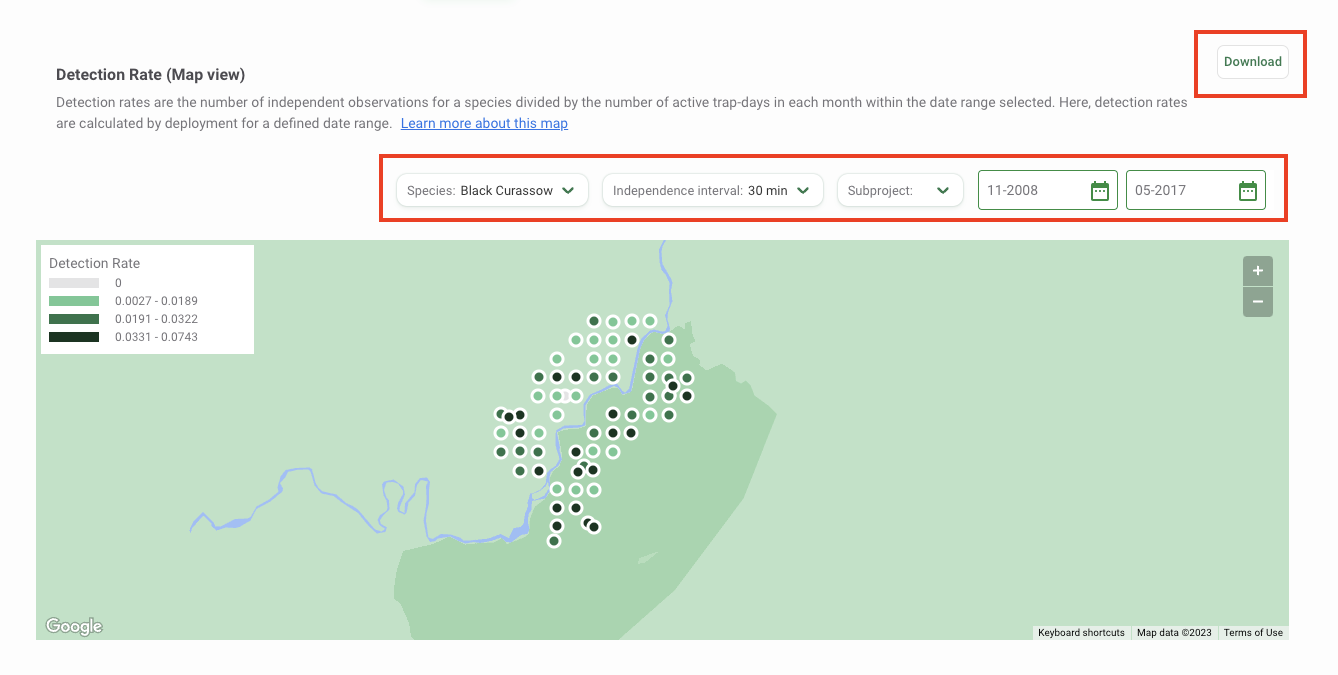
You can download the data underlying this map and a copy of the map by clicking the Download button at the top right of the map. Select the output you’d like to download:
- Map Dataset (CSV): This includes a CSV with data to reproduce the map. The data returned will reflect the subset of data defined by the filters selected in Wildlife Insights.
- Map Image (PNG): This includes a copy of the map as displayed in Wildlife Insights at the time the download was requested.
Monthly Detection Rates
The Monthly Detection Rate graph provides a summary of the detection rate for a species over time and is useful for exploring temporal patterns.
Specifically, the Monthly Detection Rate graph reports the expected number of detection events over 100 trap days in each month included in the time range selected. It is estimated based on the data collected across all locations active in a specific month. The monthly number of independent events at each active deployment is weighted by the number of active trap days at that deployment in a specific month using a generalized linear Poisson model. The expected number of detection events (over 100 trap-days) in each month is then predicted based on this model for a defined date range.
The mean is displayed by a green dot, and the 95% confidence interval estimates, displayed by a vertical line, are the expected number of independent events per 100 trap-days. Hover over the green dot to view the mean and confidence intervals.
Use the filters available above the graph to modify your analysis. Select the species you want to analyze by clicking on the Species filter. You can also modify the independence interval, which is the time used to separate images into discrete animal events. Select from a choice of 1, 2, 30, or 60 minutes. Other filters available include a Subproject filter and a Date Range filter, where you can select the start month and end month.
Use the filters available above the map to modify your analysis. Select the species you want to analyze by clicking on the Species filter. You can also modify the independence interval, which is the time used to separate images into discrete animal events. Select from a choice of 1, 2, 30, or 60 minutes. Other filters available include a Subproject filter and a Date Range filter where you can select the start month and end month.
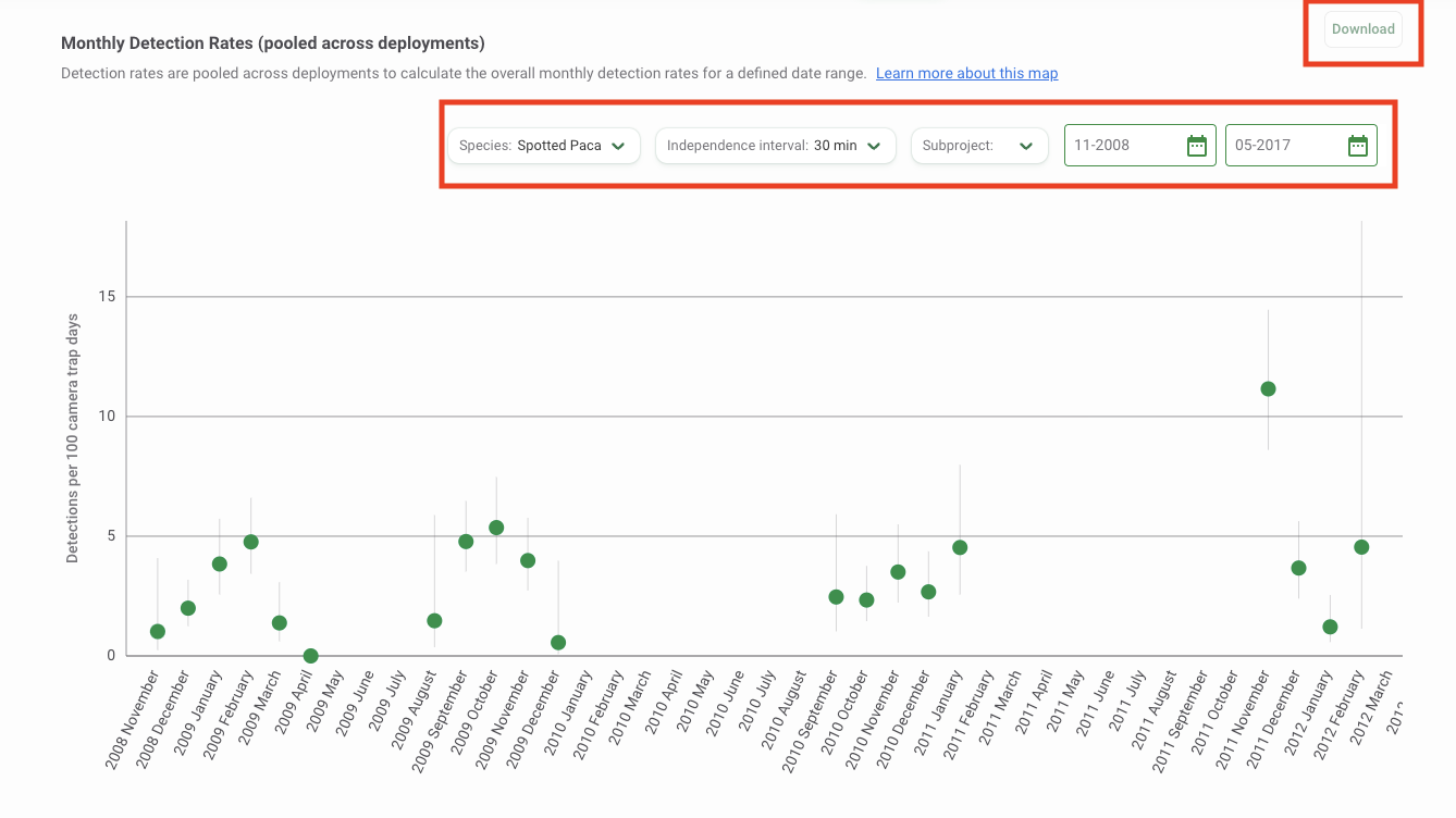
You can download the data underlying this graph and a copy of the graph by clicking the Download button at the top right of the graph. The data returned will reflect the subset of data defined by the filters selected in Wildlife Insights. Select the output you’d like to download:
- Monthly Detection by Deployment Dataset (CSV): The data returned will include records for the estimated monthly detection for each deployment.
- Overall Average Monthly Detection Dataset (CSV): This includes a CSV with data to reproduce the graph, which includes estimates of average monthly detection for the species selected (pooled across all deployment locations).
- Graph Image (PNG): This includes a copy of the graph as displayed in Wildlife Insights at the time the download was requested.
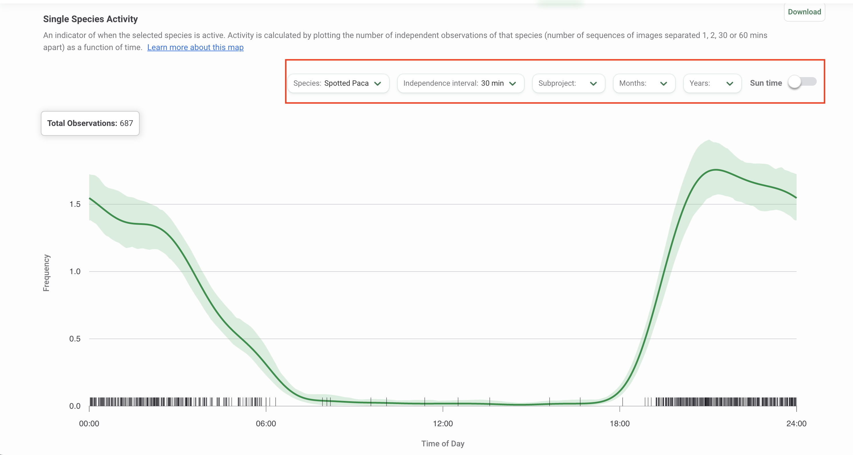
Single Species Activity
The activity pattern for a given species is the distribution of its activity throughout the daily 24-hour cycle. Single Species Activity patterns are estimated using the function fitact in the R package activity (Rowcliffe, 2021). The 95% confidence intervals are built by bootstrapping (sampling 100 times from the fitted probability density distribution). The times of day of the independent events can be transformed using average anchoring (Vazquez, 2019) by toggling the Sun time option (additional details below).
Wildlife Insights displays two Single Species Activity graphs: a line graph and a radial plot. Learn more about each visualization below.
Interpreting the Single Species Activity Line graph
- The total number of observations for the selected species is shown in the top left-hand corner.
- The x-axis represents time within the 24-hour cycle.
- The y-axis represents the frequency of activity.
- The dark green line represents the estimated mean activity.
- The light green shaded area represents the area between the upper 95% confidence limit and the lower 95% confidence limit.
- The vertical black lines above the x-axis represent an observed independent animal event.
Interpreting the Single Species Activity Radial plot
A radial plot shows the relative frequency of species activity for each time period.
- Each bar within the radial plot represents activity within a given hour. For example, the bar to the right of the ‘24’ line represents hours 0-1 in a day (i.e., 24:00 - 01:00).
- The height of the bar is determined by using the y value of the first record within the time period considered. Hover over a bar to view the y value, or relative frequency, for that time period.
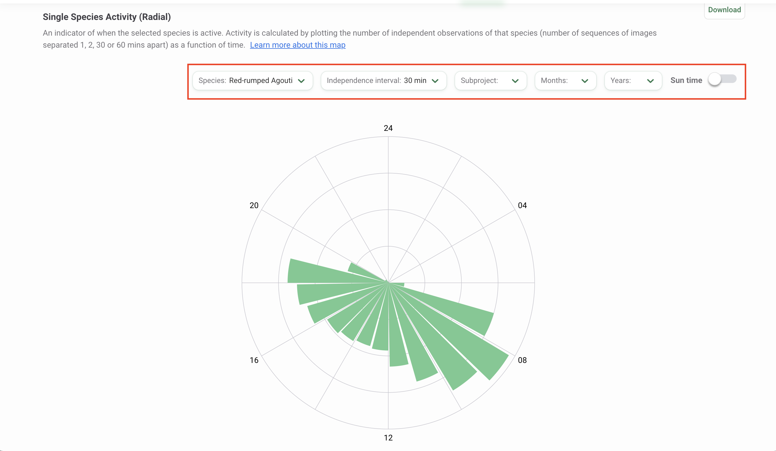
Use the filters available above the graph or plot to modify your analysis. Select the species you want to analyze by clicking on the Species filter. You can also modify the independence interval, which is the time used to separate images into discrete animal events. Select from a choice of 1, 2, 30, or 60 minutes. Other filters available include a Subproject filter and filters for Time (Months and Years).
By default, the graph is displayed using clock time (0 - 24 hours). You can view the graph or plot by solar time by toggling the Sun time option. This option applies a correction to the time values based on the average sunrise and sunset times over the study period at the study location. This correction controls for the changing sunrise and sunset times in different locations. The details of this method, called double-anchoring, are specified in Vazquez, 2019.
Two Species Activity Overlap
Two Species Activity Overlap displays the temporal overlap between pairs of species, such as predator and prey species. Overlaps are estimated using the function overlapEst in the R package overlap (Ridout and Linkie, 2009).
Interpreting the Overlap graph
- The total number of observations for each selected species is shown in the top left-hand corner. The first selected species is displayed first, and is associated with the dark green line in the graph. The second selected species is displayed second, and is associated with the grey line in the graph.
- The coefficients of overlap are presented below the total observations and describe the degree of similarity between two activity patterns as a fraction between 0 (no overlap) and 1 (total overlap). The values reported represent three different estimators of overlap. Details on these estimators are available in Ridout and Linkie, 2009.
- It is recommended to refer to Δ4 when the number of observations for each of the two species (or set of observations) is higher than 50, and to Δ1 in all the other cases.
- Δ5 is never recommended and is reported only for completeness.
- The x-axis represents time within the 24-hour cycle.
- The y-axis represents the frequency of activity.
- The dark green line represents the activity of the first species selected.
- The grey line represents the activity of the second species selected.
- The light green shaded area represents the overlap in activity between the two selected species.
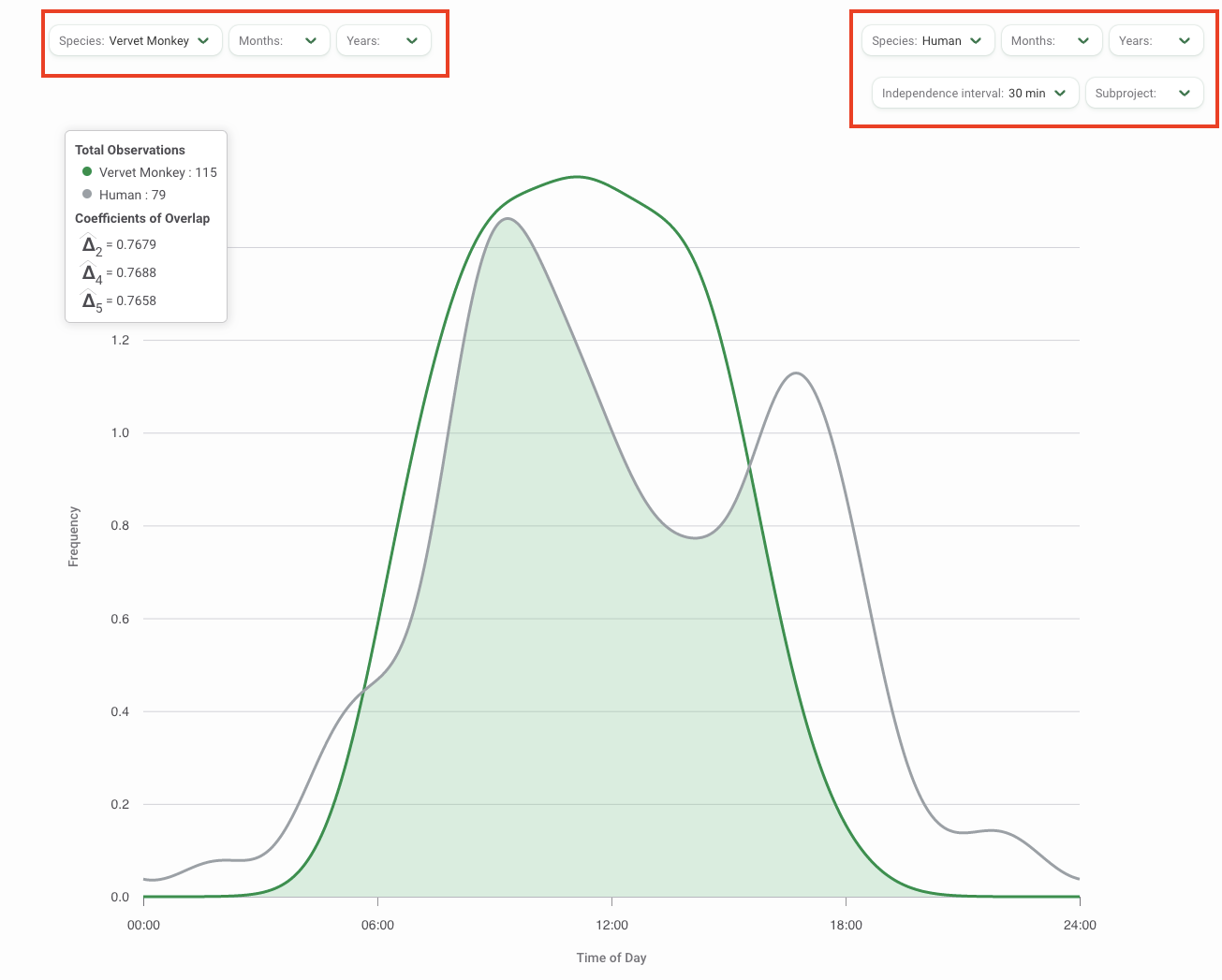
Use the filters available above the graph or plot to modify your analysis. Select the two species you want to analyze by clicking on one of the Species filters. You can also modify the independence interval, which is the time used to separate images into discrete animal events. Select from a choice of 1, 2, 30, or 60 minutes. Other filters available include a Subproject filter and filters for Time (Months and Years).
Community Detection Rates
The Community Detection Rate graph displays detection rates for all species in your filter selection. Detection rates are estimated by pooling data across space (i.e., all deployment locations) and time (i.e., all months in the date range selected). For each species, the monthly number of independent events at each active deployment is weighted by the number of active trap-days at that deployment in a specific month using a generalized linear Poisson model. The model includes the data collected at all deployments and months over the date range selected. The overall expected number of detection events (over 100 trap-days) is then predicted based on this model for a defined date range.
The species names are displayed on the Y-axis, and the detection rates on the X-axis. The mean is displayed by a green dot, and the 95% confidence interval estimates, displayed by a vertical line, are the expected number of independent events per 100 trap days. Hover over the green dot to view the mean and confidence intervals for the species.
On the top right of the graph you can adjust the Independence Interval and the Subprojects you wish to include in your analysis.
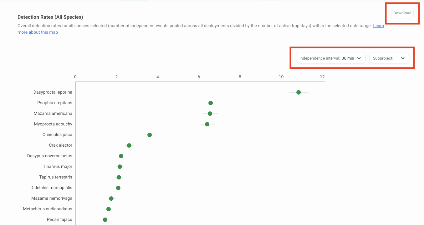
You can download the data underlying this graph and a copy of the graph by clicking the Download button at the top right of the graph. Select the output you’d like to download:
- Graph Dataset (CSV): A CSV with data to reproduce the graph. The data returned will reflect the subset of data defined by the filters selected in Wildlife Insights.
- Graph Image (PNG): A copy of the graph as displayed in Wildlife Insights at the time the download was requested.
 Back to the guide